The 60-30-10 color rule, tested on real pictures
The 60-30-10 rule is a classic of interior design: 60% of a room in one main color, 30% in a second color and 10% in an accent. It is a good place to start. We measured three pictures with Color Taste. One follows the rule almost exactly. Two break it, and they work too.
What the rule says
About 60% of a room is the dominant color: walls, floors, large furniture. About 30% is a second color: curtains, upholstery, a rug. About 10% is an accent: cushions, a lamp, a vase. Clothes work the same way: a dress or a suit, a shirt, then shoes or a bag.
The split keeps one color in charge, so the eye knows where to rest, and keeps the accent small enough to stand out.
How Color Taste measures it
Color Taste sorts every color in a picture into three groups:
- Grounds
- Near-neutral colors: off-whites, grays, beiges, browns, near-blacks, and any color too quiet to read as a hue.
- Mains
- Real colors that each cover 5% of the picture or more.
- Accents
- Real colors that each cover less than 5%.
The rule counts by job, and Color Taste counts by color. In most rooms the two meet, because the 60 is usually a ground: walls and floors tend to be quiet.
A Matisse: 58, 37, 5
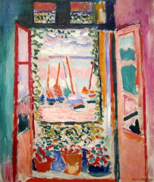
- Grounds 58%
- Oat, blush, dark slate, storm, bone
- Mains 37%
- Rust, persimmon, verdigris
- Accents 5%
- Cerise
Matisse painted Open Window, Collioure in the summer of 1905. It comes out at 58% grounds, 37% mains and 5% accents: almost exactly the rule. Its grounds are not gray. Oat, blush and bone are warm off-whites, and storm and dark slate are blue-greens quiet enough to count as neutral. The mains are rust, persimmon and verdigris, and the one accent is a cerise.
Matisse wasn’t following a rule. The split is simply a balance that works, and painters find it by eye.
An outfit: 93, 7
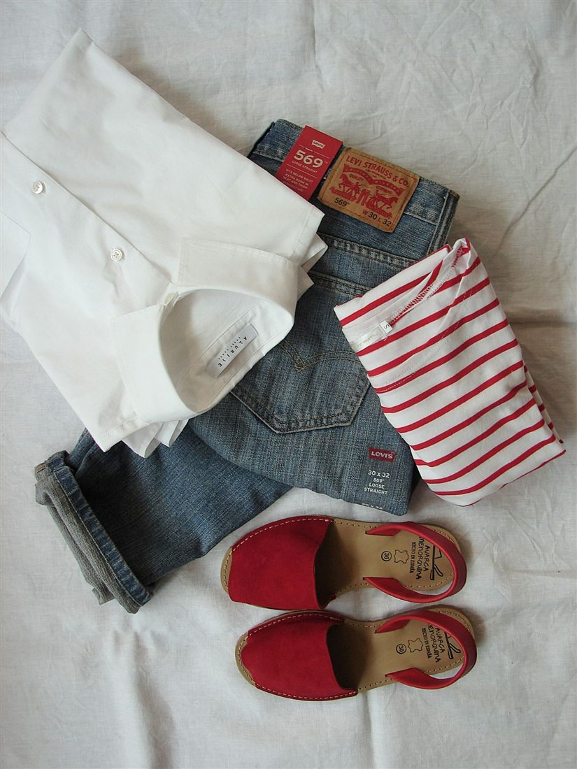
- Grounds 93%
- Stone, pale gray, dark slate, very pale gray, jet
- Mains 7%
- Garnet
- Accents 0%
- None
This outfit is 93% grounds and 7% mains, with no accents. The white shirt and the pale sheet count as grounds, and so does the denim: faded denim is a blue so quiet it works like a neutral, which is why it goes with almost anything. The only real color is garnet, in the sandals and the stripes. Color Taste calls it a main because it covers more than 5%, but it does the accent’s job.
This is the rule without its middle step: neutrals and one strong color. It works because the red has nothing to compete with.
A room: 77, 23
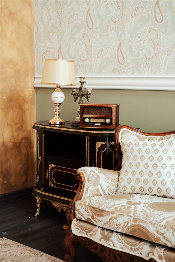
- Grounds 77%
- Greige, sand and three near-black browns
- Mains 23%
- Cream, chestnut
- Accents 0%
- None
The room is 77% grounds and 23% mains, with no accents. The greige wallpaper, the sand-colored lower wall and the near-black wood are the grounds. The two mains, cream (13%) and chestnut (10%), come from the gold and the carved wood, and they are almost the same size.
Instead of a 30 and a 10, this room has two warm colors sharing about a quarter of the space. It still feels calm, because the two are neighbors on the color wheel, not opposites.
Find your own split
The rule 60 · 30 · 10
The Matisse 58 · 37 · 5
The outfit 93 · 7 · 0
The room 77 · 23 · 0
Add your own pictures to Color Taste: rooms you like, outfits, paintings. In Color insights, the band shows your grounds, mains and accents with their shares. The Collection below it lists each group with what it suits in a room: grounds for walls, floors and large furniture, mains for textiles and upholstery, accents for objects and details.
Good to know
Count the neutrals first
Many calm rooms and outfits are mostly ground. If something feels busy, look at how much of it is real color.
The small part does the talking
An accent can cover under 1% and still be the first thing you see. See look at your painting like a stranger.
Palettes in proportion
Build similar palettes in Color Taste draws each palette in proportion: a wide ground, narrower mains, a thin accent.
Opposites need a leader
When the main colors are opposites, let one lead and keep the other smaller or softer. See complementary colors.