Complementary colors: why opposites make each other glow
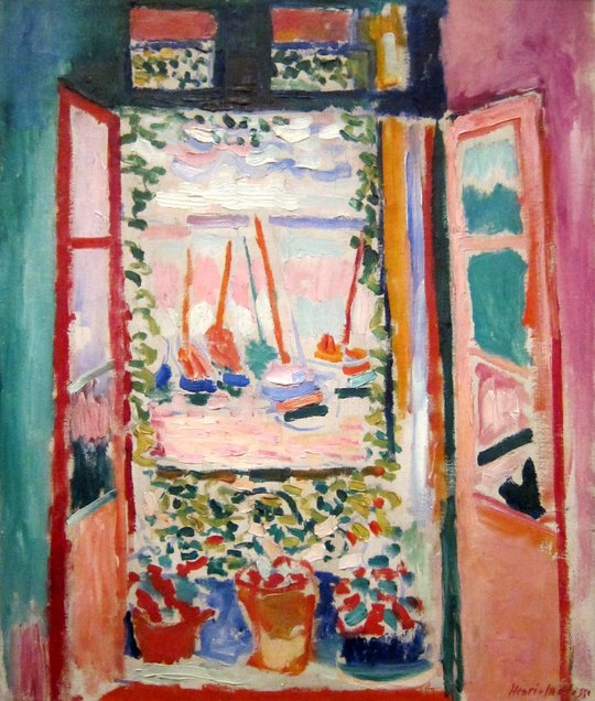
Complementary colors sit opposite each other on the color wheel. Side by side, each one makes the other look stronger. Matisse built Open Window, Collioure on such a pair, and Color Taste finds it.
Opposites on the painter’s wheel
Painters use a wheel built on red, yellow and blue. Opposite red is green, opposite yellow is violet, and opposite blue is orange. Each pair holds all three: green is yellow and blue, everything red is not. The in-between hues have opposites too: a red-orange sits opposite a blue-green.
Design apps often use a different wheel, made of red, green and blue light, where red sits opposite cyan. My Color Taste uses the painter’s wheel.
Why opposites glow
Your eye adjusts to every color it looks at, and nudges the colors around it toward the opposite. The chemist Michel-Eugène Chevreul described this in 1839, after the Gobelins tapestry works asked him why some of their dyed wools looked dull.
A gray beside rust looks slightly blue-green, and beside verdigris slightly warm. Put the two opposites side by side and each pushes the other further the way it already leans, so both look stronger.
Matisse’s rust and verdigris
Red ↔ teal: red strong, teal muted
Matisse painted Open Window, Collioure in the summer of 1905, in a fishing port in the south of France. Color Taste finds four color families in it: red, pink, orange and teal. The rust of the window frames and the verdigris of the wall on the left sit almost exactly opposite on the painter’s wheel, and a line joins them.
He doesn’t give them equal weight. Rust covers 16% of the painting and verdigris 7%, and the rust is the stronger of the two. One leads, the other answers. Color Taste sums it up in one line: “Red ↔ teal: red strong, teal muted.”
Opposite in color, equal in light
Rust and verdigris are also the same value: 5, on a scale from 0 (black) to 10 (white). In gray they almost merge.
When two colors are opposite in hue but equal in value, the edge between them can seem to shimmer. If you want a calmer pair, make one clearly lighter or darker than the other.
Find your own pair
Add your images to Color Taste. In Image analysis, each image’s card names its pair when it has one, like the Matisse’s “Red ↔ teal”. In Color insights, the painter’s wheel joins opposite families with a solid line and neighbors with a dashed one, and your counterpoint, the color that answers your lead, is named beside it.
For a single photo, choose Insights in Image to Palette.
Good to know
Let one lead
Two opposites at full strength and the same size compete. Make one bigger or brighter, like Matisse’s rust, and let the other answer. See the 60-30-10 rule, tested on real pictures.
Mix them for neutrals
In paint, a color mixed with its opposite turns gray or brown. A touch of the opposite quiets a color more gently than black does.
Near enough counts
Colors don’t have to be exactly opposite. Color Taste counts two color families as a pair when they are at least a third of the way around the wheel apart.