Warm and cool colors: how to tell them apart, even in one hue
Warm colors are the reds, oranges and yellows; cool colors are the greens, blues and violets. But temperature is relative, so a red can be warm or cool next to another red. Here is how to see it, mix with it, and find it in a painting.
The warm half and the cool half
Split the painter’s wheel in two: red, orange and yellow are the warm half, and green, blue and violet are the cool half. We tend to link the warm side with fire and sun, and the cool side with water, sky and shade.
The split is a guide, not a wall. The colors near the line, a yellow-green or a red-violet, can read as either, depending on what is beside them.
Warm and cool inside one hue
Every hue has warmer and cooler versions: the one that leans toward the warm half of the wheel is the warmer one. So a red can be warm next to one red and cool next to another.
Warm red vs cool red. A cadmium-like red leans toward orange, so it is the warm red. A crimson-like red leans toward violet, so it is the cool red.
Is blue warm or cool? Blue is cool, but some blues are warmer than others. Ultramarine leans toward violet, and so toward red, which makes it the warmer blue. Phthalo blue and cerulean lean toward green, so they are the cooler blues. Painters don’t always use the same words for this; what matters is which way a color leans.
Warm and cool grays
A gray is warm when it leans toward brown, red or yellow, and cool when it leans toward blue or green.
The lean is often small, and it shows most beside other colors. A gray next to rust looks cooler, and next to verdigris warmer: the push between opposites from complementary colors.
A warm painting and a cool one
A painting can sit almost entirely on one side of the wheel. Two of the paintings in our color games show it.
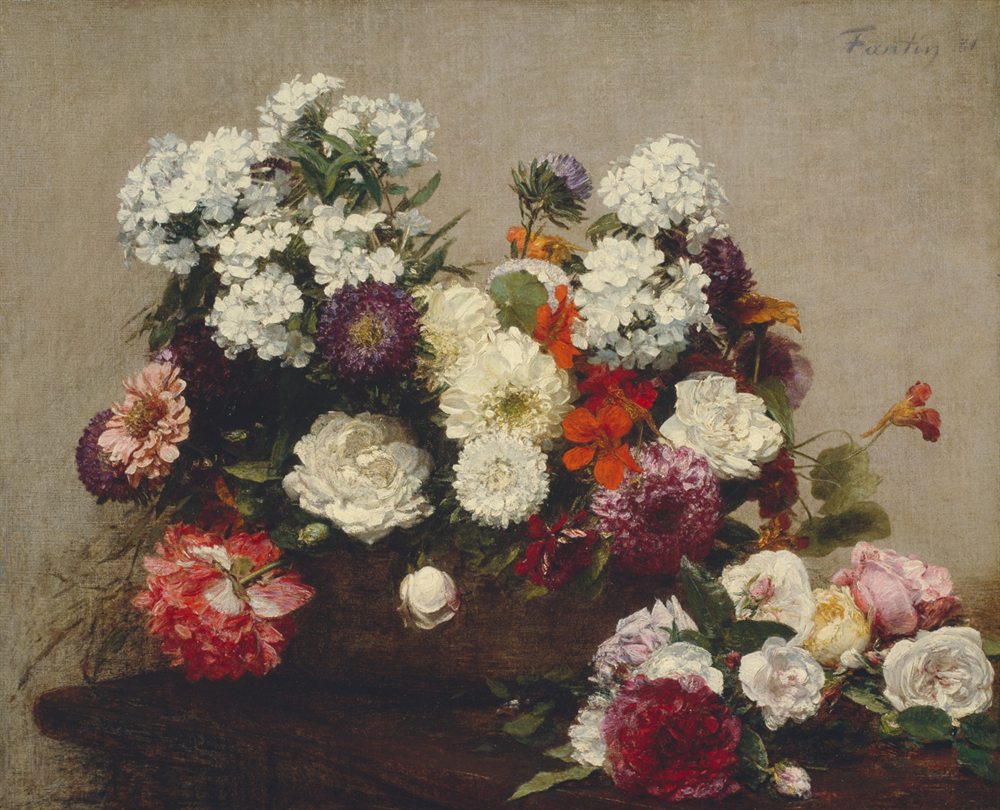
Warm: 4 of 5
Rust, fawn, khaki, crimson, plum black
Four of the five colors in Fantin-Latour’s Still Life with Flowers are warm, and the fifth, plum black, is almost neutral. Even the wall is a warm gray-beige. Look at the two reds: the crimson leans a little further toward violet than the rust, so beside it, the crimson is the cooler red.
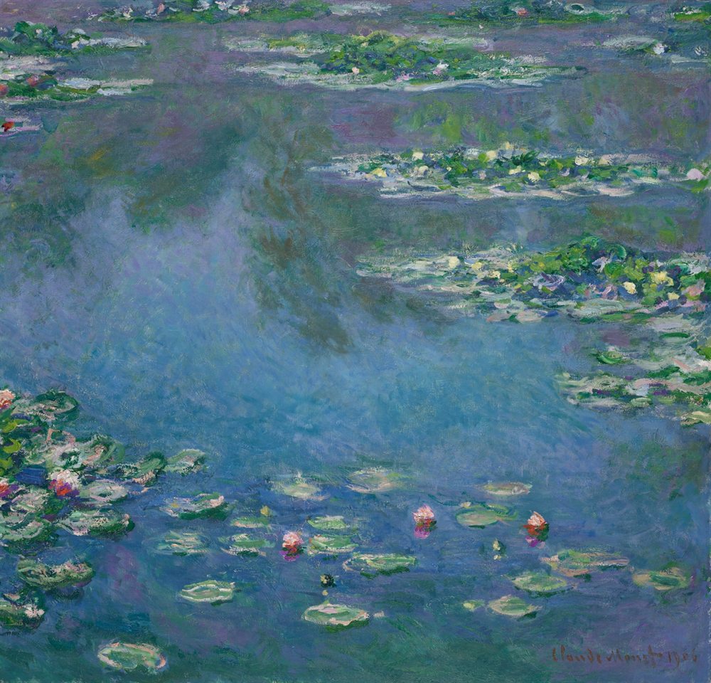
Cool: 5 of 5
Chambray, storm, deep storm, grass, moss
All five colors in Monet’s Water Lilies are cool: blues and greens. The only warm notes are a few pink blossoms, too small to make the five. Even here, temperature is relative: grass, the green nearest yellow, is the warmest of them.
Mixing clean colors
For a bright mix, use two paints that lean toward each other; for a quieter mix, use two that lean away. Painters call this the split primary palette: a warm and a cool version of each primary.
A bright orange. Mix a warm red (leaning orange) with a warm yellow (leaning orange). Both already lean toward orange, so the mix stays clean.
A duller orange. Mix a cool red (leaning violet) with a cool yellow (leaning green). The hints of violet and green bring a little of the third primary, blue, into the mix, and that grays it down.
The same works for greens and violets. A green-leaning blue with a lemon yellow gives a fresh green; ultramarine with a warm yellow gives a softer, more olive one. Neither is wrong: a duller mix is often exactly what a painting needs.
See it in your own pictures
To find the temperature of a picture, open it in Image to Palette and see which side of the wheel its colors fall on.
Choose Insights to see the colors on the painter’s wheel. Then compare two colors of the same hue and ask which one leans toward orange, and which toward violet or green.
Good to know
Warm tends to come forward
Far hills look bluer and paler because of the air in between. Painters borrow this, so warm colors tend to feel nearer and cool ones further away. It is a tendency, not a rule: lightness and contrast often matter more.
Let one temperature lead
A mostly warm picture with a small cool note, or the other way round, often feels calmer than an even split. Monet’s pink blossoms are that note.
Train your eye
The color games ask you to remember and find colors in paintings. Noticing whether a color leans warm or cool is one of the quickest ways to get closer.