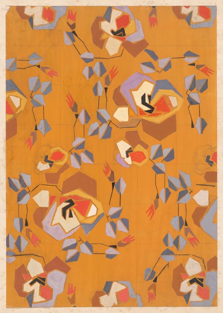
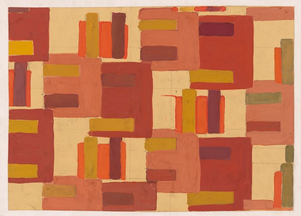
Textile Design No. IV color palette
Frances Hodgkins, c. 1925. The five main colors of the painting, with their codes and how much of it each one covers.
The five colors
- Rust#BD4F36RGB 189, 79, 5452%
- Cream#E2B77BRGB 226, 183, 12332%
- Caramel#CB8B45RGB 203, 139, 6911%
- Crimson#822E36RGB 130, 46, 543%
- Khaki#866E42RGB 134, 110, 661%
Shares are of the whole painting, rounded. Make your own palette from any picture with Image to Palette.
How the colors work
Rust rules this painting: it covers 52%, more than all the other colors together.
Crimson is the accent: only 3% of the painting, but strong enough to catch the eye.
Its values run from 3 (crimson) to 8 (cream), on a scale from 0 (black) to 10 (white): a middle range, neither hard nor hazy.
It leans warm: warm colors cover 100%, cool ones under 1%.
The same colors in gray
Each color beside its value, from light to dark. Painters check this to see the painting’s structure without its colors.
Use this palette
Open the painting in Image to Palette to choose more or fewer colors, see the mixing strips, and save the palette for Procreate or Adobe.