How to make a color palette from a photo
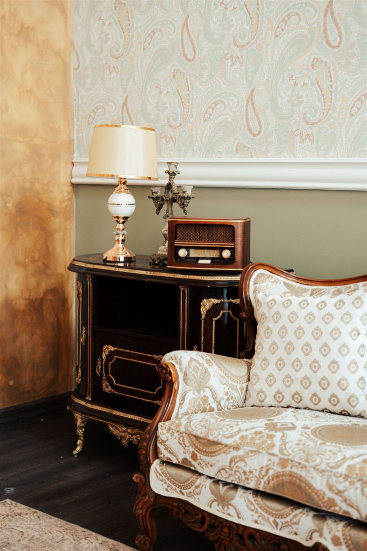
Every photo you love already holds a palette: a room, an outfit, a painting, a walk by the sea. Image to Palette finds it in about a minute, and your photo never leaves your device. Here we follow one photo, a paisley sitting room, from start to finish.
Add your photo
Open Image to Palette and tap Add image, or drag a photo onto the page. The photo is read in your browser. Nothing is uploaded.
Choose how many colors
Colors goes from 4 to 10, and starts at 5. Image to Palette doesn’t simply take the biggest areas. It keeps up to three of the most eye-catching colors, even small ones, then fills the rest with the biggest areas, and it skips near-twins, like two almost identical beiges.
4 colors
Fog, very light brown, stone, brown
5 colors
Adds soot
6 colors
Adds light brown
8 colors
Adds brown gray and almost black
At 4 colors the room loses its darkest brown, so the palette looks lighter than the room. At 5 the soot of the dark wood comes back. More colors bring in the in-between shades. Five is a good place to start: enough for a whole room, few enough to remember.
Pick a view
View shows the same colors five ways. Each one saves as a picture.
- Swatch
- The colors as pill swatches. Small circles show how each color blends into the one it touches most in the photo.
- Mosaic
- Each color’s area matches how much of the photo it covers, placed roughly where it sits.
- Strip
- One band beside or under your photo, each color as wide as its share.
- Squares
- Every color with its code, how much of the photo it covers and its role.
- Insights
- A short reading of the colors, the painter’s wheel, and how much is neutral, muted or saturated, light, mid or dark.
For this room, Insights reads “Warm neutral ground, very light brown and brown, nothing fully saturated”. Three quarters of this photo is neutral. Order sorts the colors as in the image, light to dark, or by hue.
Check it in gray
Choose See it in: Gray. The photo and the palette turn gray, and each color gets its value, from 0 (black) to 10 (white). Value is how light or dark a color is.
- Fog 8
- Very light brown 8
- Stone 7
- Brown 3
- Soot 2
Image to Palette sums it up: “Values 2 to 8. A middle range: no deep darks and no near-white.” Fog and very light brown look different in color, a cool pale gray and a golden beige, but both are value 8. Side by side they will blend. Colors far apart in value stand out from each other, which matters for text, patterns and anything you want people to notice.
Copy the codes
Under the palette, Color codes lists every color as HEX, RGB, HSL, OKLCH or CMYK. Tap a code to copy it, or use Copy all, Copy as CSS or Copy for Tailwind. CMYK is an approximation, so check print colors with your printer.
Beside it, Text contrast shows which pairs in your palette are easy to read as text, checked with the WCAG contrast guidelines, and whether white or black text reads best on each color.
Mixing strips, next to the codes, show any color with white, gray or black added, in even steps. Tap a step to copy its code.
Save your palette
Tap Save palette. You can save the view as a picture, in high resolution (2160px) or standard (1080px), with or without your photo. Or save it as a swatch file:
- Procreate
- A .swatches file. See how to import a color palette into Procreate.
- Adobe
- An .ase file, for Photoshop and Illustrator.
- CSS
- Color variables for a website.
- JSON
- For apps and code.
On a phone, saving opens your share sheet, so you can keep the picture in Photos or send it straight on.
Good to know
Crop to what you want
If you only want the sofa, crop the photo to the sofa before you add it. The palette comes from everything in the frame.
Light changes color
The same room looks warmer at sunset and bluer on a cloudy day. For the truest palette, use a photo taken in daylight, without a filter.
Many photos at once
Color Taste reads up to twelve images together and shows the colors you keep coming back to.
How much of each color
A palette is also about proportion. See the 60-30-10 rule, tested on real pictures.