Van Gogh’s colour palette: how to analyse a painter’s colour taste
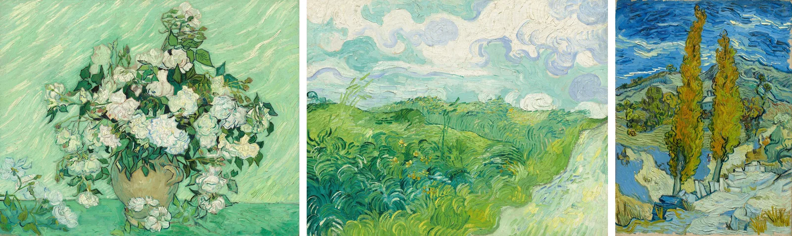
Pick three paintings by an artist you love, and Colour Taste shows the pattern behind them: how much is neutral, which accent they keep coming back to, and how light or dark they work. Here’s how, using three paintings Van Gogh made in his last two years.
Choose three paintings from one period
Pick three or more paintings by the same artist. Paintings from the same few years work best, because a painter’s palette can change a lot over a career. I chose three Van Gogh paintings from 1889 and 1890.
Many museums share their old paintings as public domain images, free for anyone to use. On Unsplash, look for the label “Dual License: Public Domain & Unsplash License”.
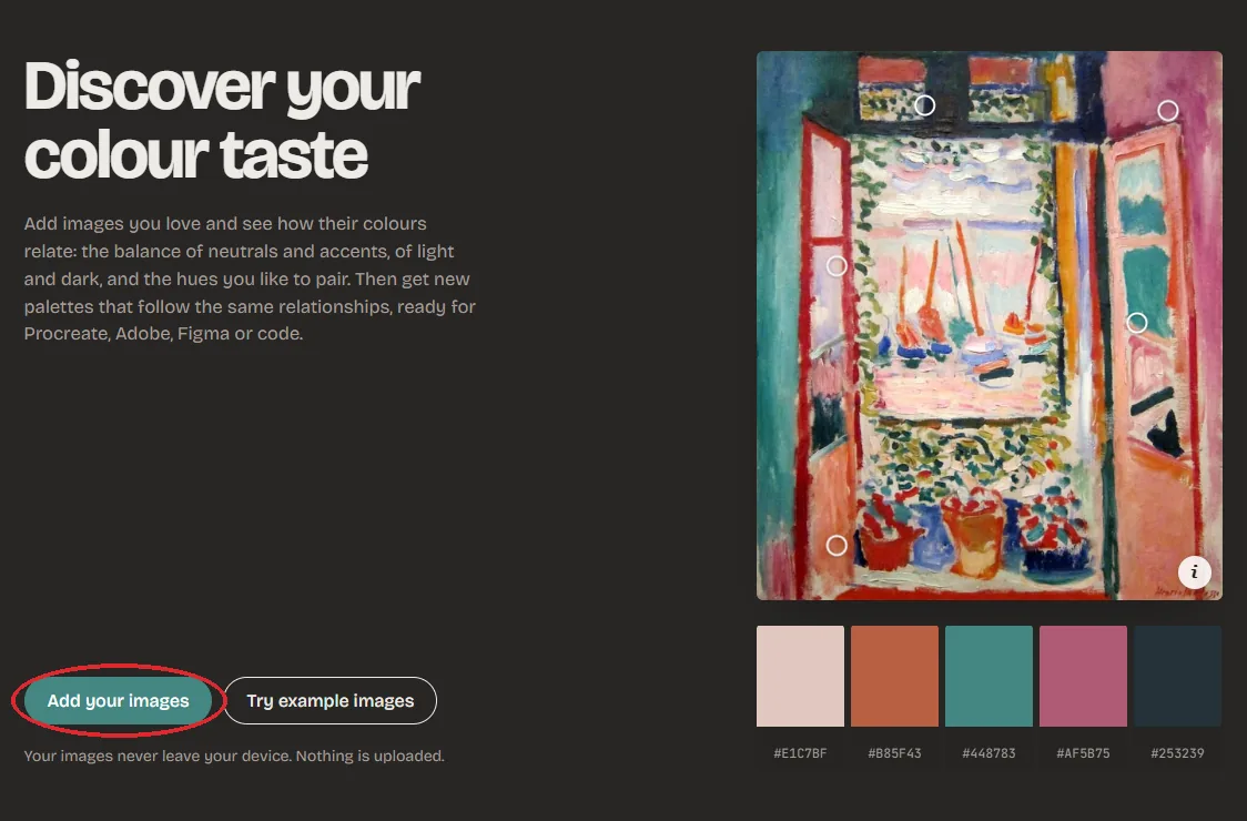
Open Colour Taste
Go to mycolourtaste.com and click Add your images.
Add the paintings
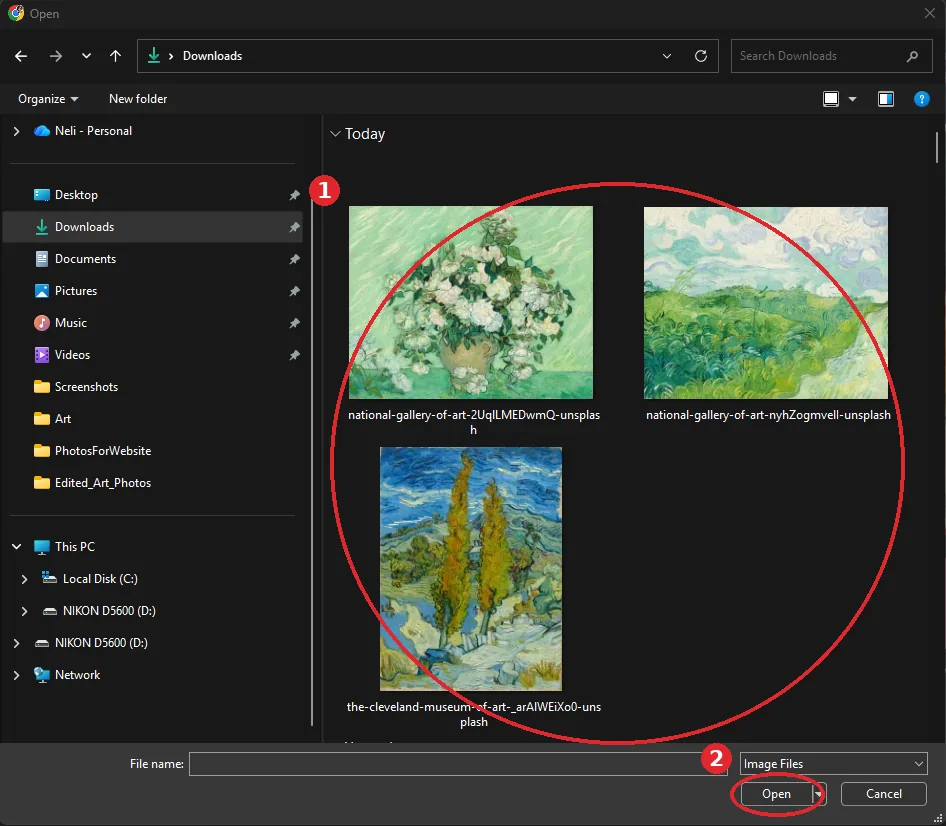
Select all the paintings at once (1). On a computer, hold Ctrl, or Cmd on a Mac, as you click each one. Then click Open (2). On an iPad or phone, you pick them from your photos instead.
The paintings stay on your device. Nothing is uploaded.
Look at the colour space
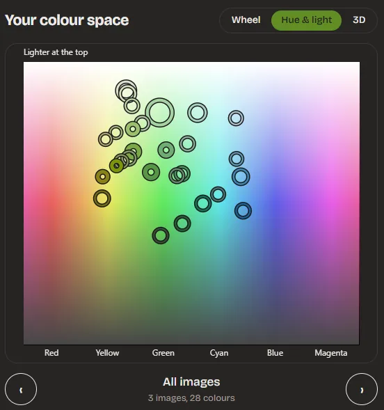
Each ring is one colour found in the paintings. On the Wheel, soft and greyed colours sit near the middle and vivid ones near the edge.
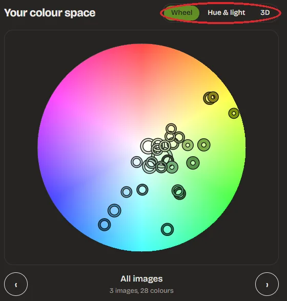
Hue & light spreads the same colours by hue from left to right, with lighter colours at the top. Van Gogh’s colours fill the yellows, greens, cyans and blues, and leave the reds and magentas almost empty.
Read what the taste says
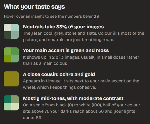
Below the colour space, What your taste says sums up the pattern. Hover over an insight to see the numbers behind it. For these three paintings:
Neutrals take a third of the paintings, and they lean cool: grey, stone and slate. The main accent is green and moss, with ochre and gold as a close cousin, the colour of the poplars. And it’s mostly mid-tones with moderate contrast: half the colour sits above 71 on a scale from black (0) to white (100).
Get palettes in Van Gogh’s taste
Palettes for you builds new palettes on the same proportions. Van Gogh’s usual mix here is 42% light background, 31% mid background, 7% dark anchor, 15% accent and 5% opposite.
Click Shuffle palettes for new ones, and tap the heart on any you want to keep. You can save each palette as an image, or as Procreate and Adobe swatches.
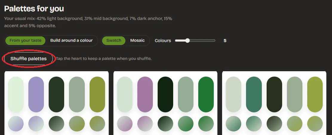
The small opposite colour is there for contrast. With Van Gogh it comes out as a soft purple, a colour he barely used in these paintings, so swap it out if you want to stay closer to him.
Good to know
Compare two periods
Try his dark early Dutch paintings against these late ones, and watch the colour space change.
Try other painters
Monet, Matisse and Klimt are all in the public domain, and museums share many of their paintings for free.
Try your own work
The same steps work with photos of your own paintings. It’s a good way to see your own habits.
One painting at a time
Image to Palette finds the palette in a single painting, ready for Procreate.
Paintings by Vincent van Gogh, in the public domain. Roses and Green Wheat Fields, Auvers are shared by the National Gallery of Art, Washington, and Two Poplars in the Alpilles near Saint-Rémy by the Cleveland Museum of Art, all via Unsplash.