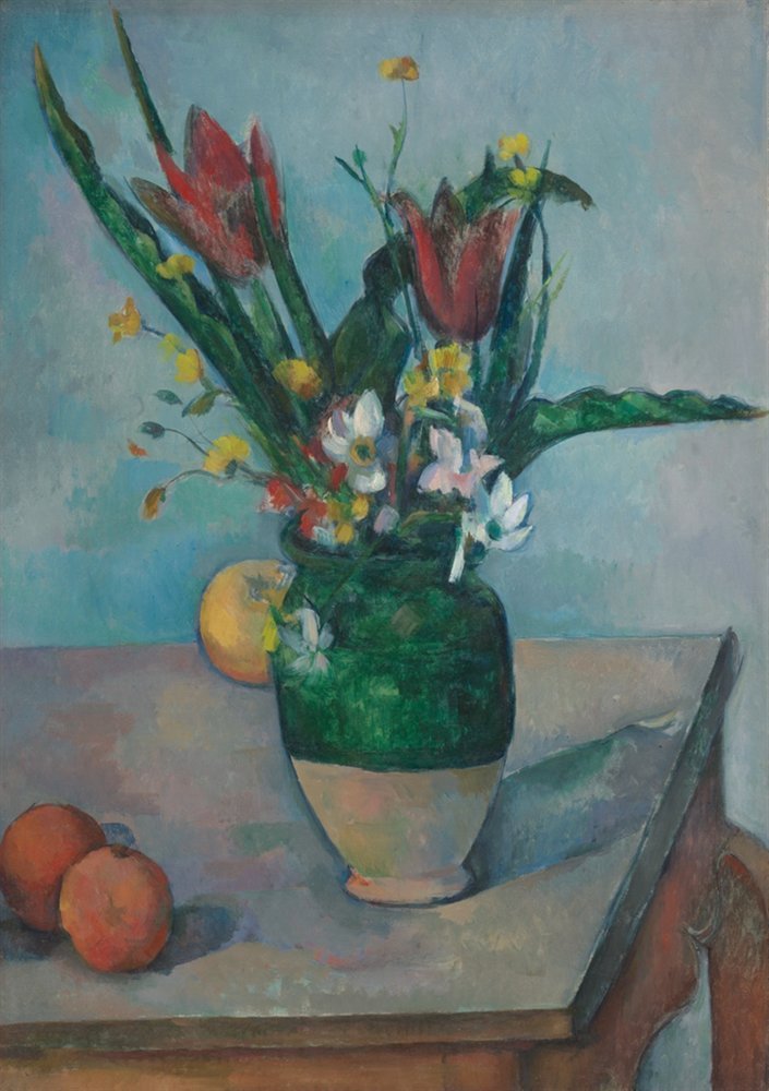
The Vase of Tulips color palette
Paul Cézanne, c. 1890. The five main colors of the painting, with their codes and how much of it each one covers.
The five colors
- Very deep slate#32514CRGB 50, 81, 7624%
- Khaki#97815CRGB 151, 129, 9213%
- Verdigris#508891RGB 80, 136, 14512%
- Deep teal#206A47RGB 32, 106, 716%
- Terracotta#8C4A3DRGB 140, 74, 615%
Shares are of the whole painting, rounded. Make your own palette from any picture with Image to Palette.
How the colors work
Very deep slate leads with 24% of the painting, and khaki follows with 13%.
Terracotta is the accent: only 5% of the painting, but enough to lift the rest.
All five colors sit close in light, between value 3 and 6 on a scale from 0 (black) to 10 (white), which keeps the painting soft and even.
It leans cool: cool colors cover 71%, warm ones 29%.
Verdigris and terracotta sit on opposite sides of the color wheel, so each makes the other look stronger (see complementary colors).
The same colors in gray
Each color beside its value, from light to dark. Painters check this to see the painting’s structure without its colors.
Use this palette
Open the painting in Image to Palette to choose more or fewer colors, see the mixing strips, and save the palette for Procreate or Adobe.