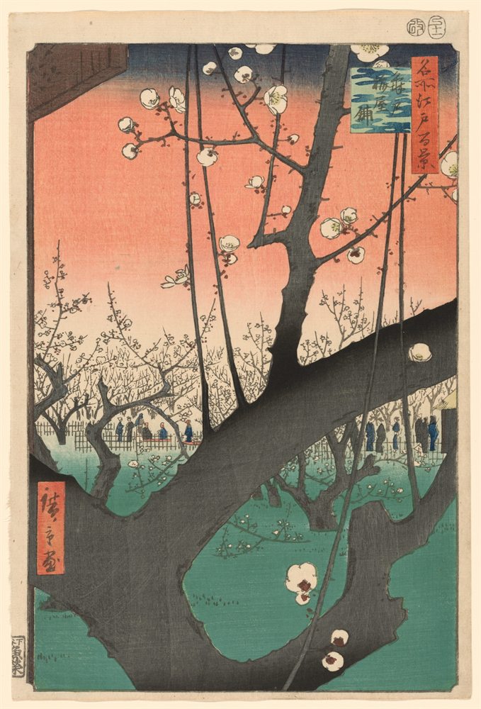
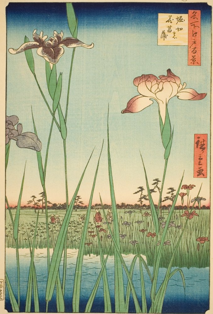
Irises at Horikiri color palette
Utagawa Hiroshige, 1857. The five main colors of the print, with their codes and how much of it each one covers.
The five colors
- Cream#DBC69BRGB 219, 198, 15549%
- Sage#849865RGB 132, 152, 10115%
- Moss#5F7042RGB 95, 112, 6610%
- Sage gray#9DAF99RGB 157, 175, 1538%
- Lichen#618D8CRGB 97, 141, 1407%
Shares are of the whole print, rounded. Make your own palette from any picture with Image to Palette.
How the colors work
Cream rules this print: it covers 49%, close to half of it.
Its values run from 4 (moss) to 8 (cream), on a scale from 0 (black) to 10 (white): a middle range, neither hard nor hazy.
Warm and cool are close to balanced: 55% warm, 45% cool.
The same colors in gray
Each color beside its value, from light to dark. Painters check this to see the print’s structure without its colors.
Cream 8
Sage gray 7
Sage 6
Lichen 6
Moss 4
Use this palette
Open the print in Image to Palette to choose more or fewer colors, see the mixing strips, and save the palette for Procreate or Adobe.