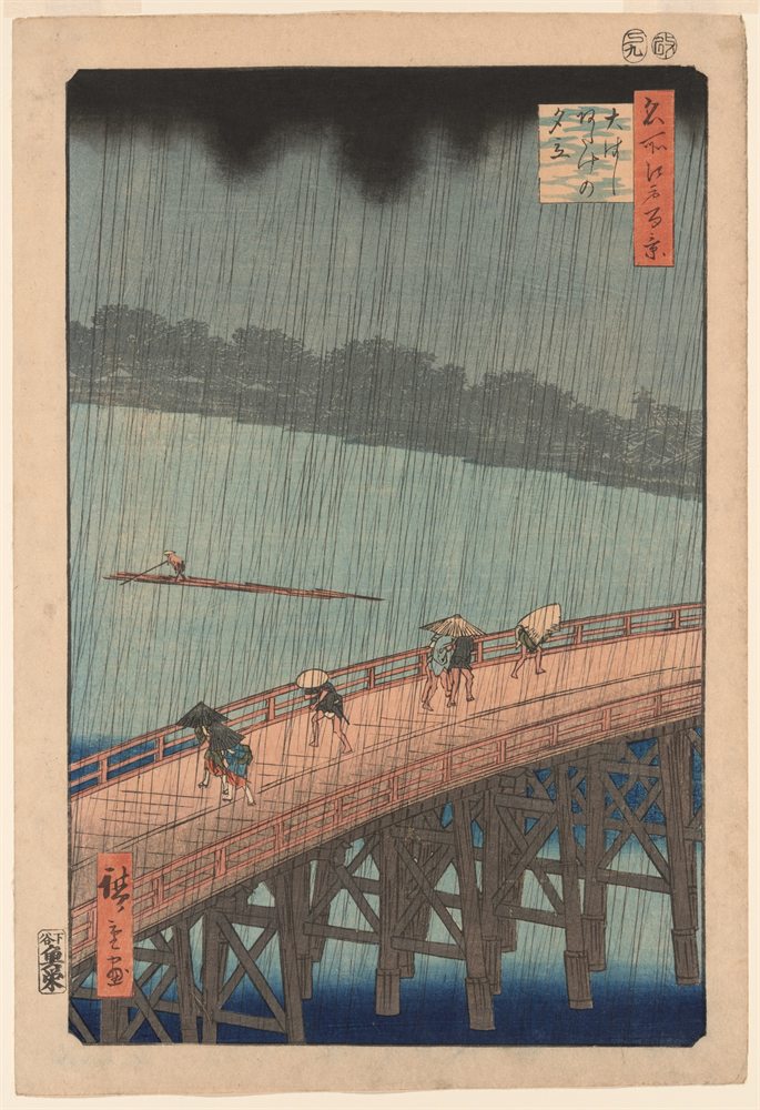
Sudden Shower over Shin-Ōhashi Bridge and Atake color palette
Utagawa Hiroshige, 1857. The six main colors of the print, with their codes and how much of it each one covers.
The six colors
- Lichen#868A7ERGB 134, 138, 12633%
- Biscuit#D2AC8ERGB 210, 172, 14222%
- Mole#696A62RGB 105, 106, 9813%
- Charcoal#322E2BRGB 50, 46, 438%
- Vermilion#BD725ARGB 189, 114, 904%
- Deep blue#34526ARGB 52, 82, 1061%
Colors picked by hand by the painter Neli Chaneva. Shares are of the whole print, rounded. Make your own palette from any picture with Image to Palette.
How the colors work
Lichen leads with 33% of the print, and biscuit follows with 22%.
Vermilion is the accent: only 4% of the print, but strong enough to catch the eye.
Its values run from 2 (charcoal) to 7 (biscuit), on a scale from 0 (black) to 10 (white): a middle range, neither hard nor hazy.
Most of it is near-neutral (66% of these colors): grays, browns and creams that let the few real colors speak.
Biscuit and deep blue sit on opposite sides of the color wheel, so each makes the other look stronger (see complementary colors).
The same colors in gray
Each color beside its value, from light to dark. Painters check this to see the print’s structure without its colors.
Use this palette
Open the print in Image to Palette to choose more or fewer colors, see the mixing strips, and save the palette for Procreate or Adobe.