Mäda Primavesi color palette
Gustav Klimt, 1912–13. The six main colors of the painting, with their codes and how much of it each one covers.
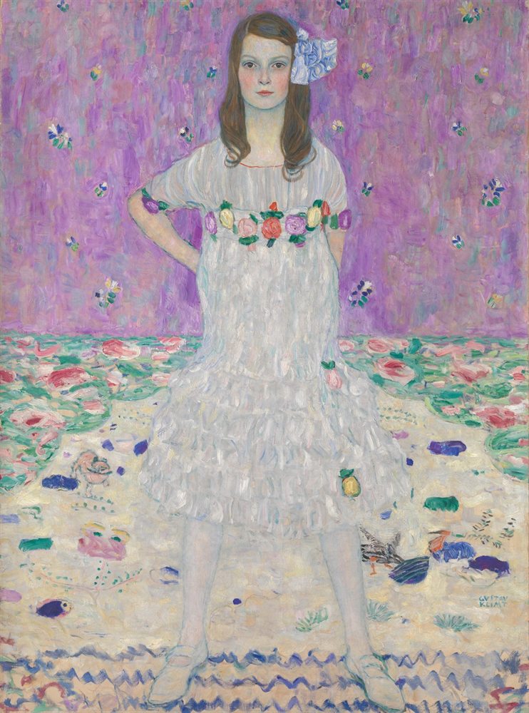
The six colors
- Oat#C6BBABRGB 198, 187, 17149%
- Heather#A87CAARGB 168, 124, 17034%
- Dusty rose#C0757CRGB 192, 117, 1242%
- Chambray#5F72A8RGB 95, 114, 1682%
- Celadon#459385RGB 69, 147, 1332%
- Mole#5F5549RGB 95, 85, 732%
Colors picked by hand by the painter Neli Chaneva. Shares are of the whole painting, rounded. Make your own palette from any picture with Image to Palette.
How the colors work
Oat rules this painting: it covers 49%, close to half of it.
Dusty rose is the accent: only 2% of the painting, but enough to lift the rest.
Its values run from 4 (mole) to 8 (oat), on a scale from 0 (black) to 10 (white): a middle range, neither hard nor hazy.
It leans cool: cool colors cover 42%, warm ones 2%.
Dusty rose and celadon sit on opposite sides of the color wheel, so each makes the other look stronger (see complementary colors).
The same colors in gray
Each color beside its value, from light to dark. Painters check this to see the painting’s structure without its colors.
Use this palette
Open the painting in Image to Palette to choose more or fewer colors, see the mixing strips, and save the palette for Procreate or Adobe.