Rocks at the Lighthouse, Biarritz color palette
Joaquín Sorolla, 1906. The six main colors of the painting, with their codes and how much of it each one covers.
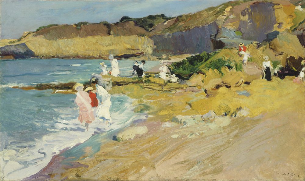
The six colors
- Lemon#CCB652RGB 204, 182, 8228%
- Slate#708E91RGB 112, 142, 14511%
- Storm#555765RGB 85, 87, 10111%
- Moss#5E712BRGB 94, 113, 432%
- Cream#EDE8C8RGB 237, 232, 2001%
- Rust#BA4926RGB 186, 73, 38under 1%
Colors picked by hand by the painter Neli Chaneva. Shares are of the whole painting, rounded. Make your own palette from any picture with Image to Palette.
How the colors work
Lemon leads with 28% of the painting, and slate follows with 11%.
Rust is the accent: only 1% of the painting, but strong enough to catch the eye.
Its values run from 4 (storm) to 9 (cream), on a scale from 0 (black) to 10 (white): a middle range, neither hard nor hazy.
It leans warm: warm colors cover 55%, cool ones 4%.
The same colors in gray
Each color beside its value, from light to dark. Painters check this to see the painting’s structure without its colors.
Use this palette
Open the painting in Image to Palette to choose more or fewer colors, see the mixing strips, and save the palette for Procreate or Adobe.