The Courtesan Arihara of the Tsuruya color palette
Kitagawa Utamaro, c. 1797. The six main colors of the print, with their codes and how much of it each one covers.
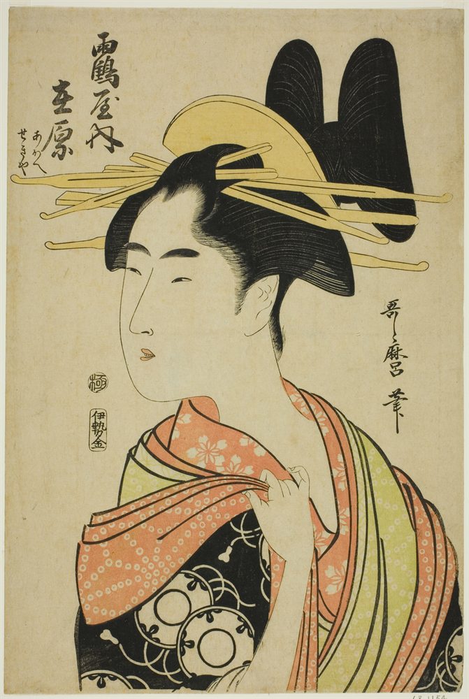
The six colors
- Parchment#CDC39DRGB 205, 195, 15745%
- Pale cream#C1B672RGB 193, 182, 11417%
- Camel#CB8D5CRGB 203, 141, 9212%
- Jet#242520RGB 36, 37, 3211%
- Umber#473211RGB 71, 50, 177%
- Cream#CAB269RGB 202, 178, 1055%
Colors picked by hand by the painter Neli Chaneva. Shares are of the whole print, rounded. Make your own palette from any picture with Image to Palette.
How the colors work
Parchment rules this print: it covers 45%, close to half of it.
Cream is the accent: only 5% of the print, but enough to lift the rest.
Light and dark are far apart: from parchment at value 8 down to jet at 1, on a scale from 0 (black) to 10 (white). That range gives the print its strong contrast.
It leans warm: warm colors cover 88%, cool ones under 1%.
The same colors in gray
Each color beside its value, from light to dark. Painters check this to see the print’s structure without its colors.
Use this palette
Open the print in Image to Palette to choose more or fewer colors, see the mixing strips, and save the palette for Procreate or Adobe.