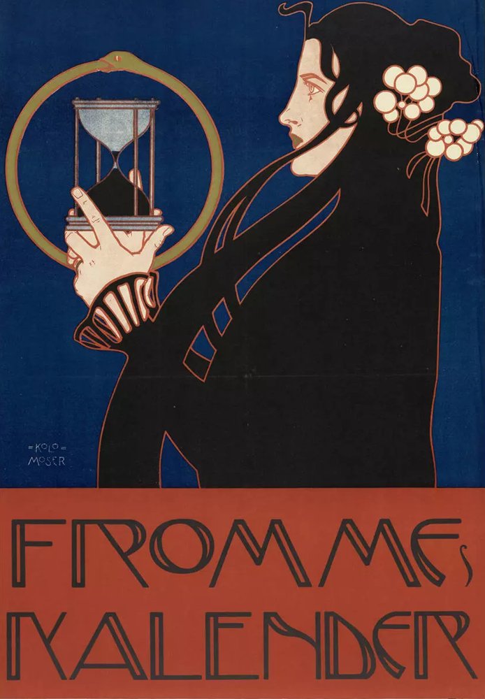
Poster for Fromme's Calendar color palette
Koloman Moser, 1912–13. The five main colors of the print, with their codes and how much of it each one covers.
The five colors
- Jet#1A1919RGB 26, 25, 2533%
- Deep midnight#0D2850RGB 13, 40, 8031%
- Rust#A4422FRGB 164, 66, 4729%
- Linen#E7D0B4RGB 231, 208, 1804%
- Straw#908249RGB 144, 130, 731%
Shares are of the whole print, rounded. Make your own palette from any picture with Image to Palette.
How the colors work
Jet leads with 33% of the print, and deep midnight follows with 31%.
Straw is the accent: only 1% of the print, but enough to lift the rest.
Light and dark are far apart: from linen at value 8 down to jet at 1, on a scale from 0 (black) to 10 (white). That range gives the print its strong contrast.
Warm and cool are close to balanced: 35% warm, 32% cool.
Deep midnight and straw sit on opposite sides of the color wheel, so each makes the other look stronger (see complementary colors).
The same colors in gray
Each color beside its value, from light to dark. Painters check this to see the print’s structure without its colors.
Use this palette
Open the print in Image to Palette to choose more or fewer colors, see the mixing strips, and save the palette for Procreate or Adobe.